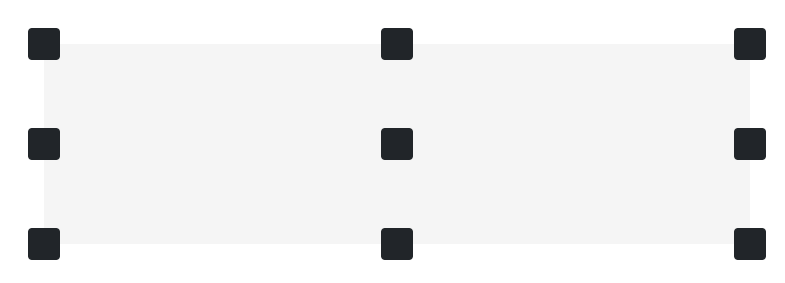
布局 槽(Gutters) 垂直 gutters gy-*类可用于控制垂直 gutter 宽度。
padding padding padding padding
布局工具 Flexbox 选项 Bootstrap是用flexbox构建的,但并不是每个元素的display都被更改为display: flex,因为这将添加许多不必要的覆盖,并意外地更改主流浏览器行为。我们的大多数组件都是在启用flexbox的情况下构建的。
如果需要将display: flex 添加到元素中,请使用.d-flex或其中一种响应式变体(例如 .d-sm-flex)进行添加。您将需要这个类或display值来允许使用我们额外的 flexbox 实用程序来调整大小、对齐、间距等。
Z-index 内容 排版 标题 对于希望与标题的字体样式匹配但不能使用关联的HTML元素的样式,也可以使用.h1到 .h6 类。
块引用 对准 根据需要使用文本实用程序更改blockquote的对齐方式。
a ante.Source Titlea ante.Source Title
图片 文档和示例,用于将图像选择为响应行为(因此它们永远不会比其父元素大),并通过类向它们添加轻量级样式。
响应式图像 Bootstrap的图像使用 .img-fluid进行响应。 这将对图像应用 max-width: 100%; 和 height: auto;,以便它随父元素缩放。
图片区 组件 卡片 卡片布局 网格卡片 使用Bootstrap网格系统及其.row-cols类来控制每行显示多少网格列(包装在卡片周围)。例如,这里的.row-cols-1将卡片放在一列上,.row-cols-md-2将四张卡片从中间断点向上分割成多行的等宽。
is a longer card with supporting text below as a natural lead-in to additional content. This content is a little bit longer.
当你需要等高时,在卡片上加上 .h-100。
is a longer card with supporting text below as a natural lead-in to additional content. This content is a little bit longer.
就像卡片组一样,卡片页脚会自动排列。
is a wider card with supporting text below as a natural lead-in to additional content. This card has even longer content than the first to show that equal height action.3 mins ago
助手 比例 长宽比 默认情况下,提供以下比例类:
延伸链接(Stretched link) 通过CSS将链接“延伸”,令任何HTML元素或Bootstrap元件变得可点击。
向链接添加 .stretched-link ,使其包含块可通过 ::after伪元素单击。在大多数情况下,这意味着position: relative 的元素包含 .stretched-link 的链接是可单击的。
卡片在 Bootstrap 中默认具有 position: relative,此在这种情况下,您可以安全地将 .stretched-link 类添加到卡片中的链接,而无需任何其他HTML更改。
对于拉伸链接,不建议使用多个链接和点击目标。但是,如果需要,某些 position 和 z-index样式可以提供帮助。
text to build on the card title and make up the bulk of the card's content."#" class ="btn btn-primary stretched-link" >Go somewhere</a>
大多数自定义组件在默认情况下没有 position: relative ,因此我们需要在此处添加 .position-relative ,以防止链接延伸到父元素之外。
with stretched linkin gravida nulla. Nulla vel metus scelerisque ante sollicitudin. Cras purus odio, vestibulum in vulputate at, tempus viverra turpis. Fusce condimentum nunc ac nisi vulputate fringilla. Donec lacinia congue felis in faucibus."#" class ="stretched-link" >Go somewhere</a>
工具类 边框 边框 添加 边框颜色 颜色(Colors) 背景颜色 通过.bg-*来设置背景颜色,在某些情况下您需要使用 .text-* 来设置文本颜色。
.bg-primary

.bg-secondary

.bg-success

.bg-danger

.bg-warning

.bg-info

.bg-light

.bg-dark

.bg-white

.bg-transparent
Flex布局 借助一整套响应式Flexbox实用程序,快速管理网格列,导航,组件等的布局,对齐和大小。对于更复杂的实现,可能需要自定义CSS。
启用弹性行为 应用 display 实用程序创建flexbox容器并将直接子元素转换为flex项。Flex容器和项目可以通过附加的Flex属性进行进一步修改。
.d-flex 和 .d-inline-flex也存在响应式变化。
.d-flex

.d-inline-flex

.d-sm-flex

.d-sm-inline-flex

.d-md-flex

.d-md-inline-flex

.d-lg-flex

.d-lg-inline-flex

.d-xl-flex

.d-xl-inline-flex

.d-xxl-flex

.d-xxl-inline-flex
方向 使用 .flex-row设置水平方向(浏览器默认设置),或使用 .flex-row-reverse从另一侧开始水平方向。
使用 .flex-column 设置垂直方向,或使用 .flex-column-reverse 从另一侧开始垂直方向。
flex-direction也存在响应式变化。
.flex-row

.flex-row-reverse

.flex-column

.flex-column-reverse

.flex-sm-row

.flex-sm-row-reverse

.flex-sm-column

.flex-sm-column-reverse

.flex-md-row

.flex-md-row-reverse

.flex-md-column

.flex-md-column-reverse

.flex-lg-row

.flex-lg-row-reverse

.flex-lg-column

.flex-lg-column-reverse

.flex-xl-row

.flex-xl-row-reverse

.flex-xl-column

.flex-xl-column-reverse

.flex-xxl-row

.flex-xxl-row-reverse

.flex-xxl-column

.flex-xxl-column-reverse
调整内容 在flexbox容器上使用 justify-content 实用程序可以更改弹性项在主轴上的对齐方式(开始时为x轴,如果是flex-direction: column,则为y轴)。从 start (浏览器默认设置)、 end、 center、 between、 around或 evenly中进行选择。
justify-content也有响应式的变化。
.justify-content-start

.justify-content-end

.justify-content-center

.justify-content-between

.justify-content-around

.justify-content-evenly

.justify-content-sm-start

.justify-content-sm-end

.justify-content-sm-center

.justify-content-sm-between

.justify-content-sm-around

.justify-content-sm-evenly

.justify-content-md-start

.justify-content-md-end

.justify-content-md-center

.justify-content-md-between

.justify-content-md-around

.justify-content-md-evenly

.justify-content-lg-start

.justify-content-lg-end

.justify-content-lg-center

.justify-content-lg-between

.justify-content-lg-around

.justify-content-lg-evenly

.justify-content-xl-start

.justify-content-xl-end

.justify-content-xl-center

.justify-content-xl-between

.justify-content-xl-around

.justify-content-xl-evenly

.justify-content-xxl-start

.justify-content-xxl-end

.justify-content-xxl-center

.justify-content-xxl-between

.justify-content-xxl-around

.justify-content-xxl-evenly
定位(Position) 位置值 排列元素 使用边缘定位工具轻松排列元素。格式为{property}-{position}.
其中 {property} 是以下之一:
top - 用于垂直top 位置left 位置 (in LTR)bottom - 用于垂直 bottom 位置right 位置 (in LTR)
其中 {position} 是以下之一:
0 - 表示 0 边缘位置50 - 表示 50 % 边缘位置100 - 表示 100 % 边缘位置
范例
中心元素 此外,还可以使用transform类.translate-middle将元素居中。
此类将translateX(-50%) 和 translateY(-50%) 转换应用于元素,该转换与边定位实用程序结合使用,允许您将元素绝对居中。
通过添加 .translate-middle-x 或 .translate-middle-y 类,元素只能水平或垂直放置。
阴影(Shadows) shadow shadow shadow shadow
间距(Spacing) Bootstrap包括各种速记响应边距,填充和间隙实用程序类,用于修改元素的外观。
边距和填充 使用速记类为元素或其边的子集指定友好margin 或 padding 值。包括对单个属性、所有属性以及垂直和水平属性的支持。
符号 适用于所有断点(从xs 到 xxl)的间距实用程序中没有断点缩写。这是因为这些类是从 min-width: 0 及以上应用的,因此不受媒体查询的约束。但是,其余的断点确实包含断点缩写。
这些类的命名格式为 {property}{sides}-{size} ( 对于xs), 和 {property}{sides}-{breakpoint}-{size} (对于 sm, md, lg, xl 和 xxl)。
其中属性是以下之一:
margin 的类p - 对于设置 padding 的类
其中边 是以下之一:
margin-top 或 padding-top 的类b - 对于设置 margin-bottom 或 padding-bottom 的类margin-left 或 padding-left 的类(在 LTR), margin-right 或 padding-right 的类(在 RTL)margin-right 或 padding-right 的类(在 LTR), margin-left 或 padding-left 的类(在 RTL)x - 对于设置 *-left 和 *-right 的类y - 对于设置 *-top 和 *-bottom 的类4 个边上设置 margin 或 padding 的类
其中 size是以下之一:
0 - 对于通过将其设置为0 来消除 margin 或 padding 的类1 - 默认情况下)对于将 margin 或 padding 设置为 $spacer * .25 的类2 - 默认情况下)对于将 margin 或 padding 设置为 $spacer * .5 的类3 - 默认情况下)对于将 margin 或 padding 设置为 $spacer 的类4 - 默认情况下)对于将 margin 或 padding 设置为 $spacer * 1.5 的类5 - 默认情况下)对于将 margin 或 padding 设置为 $spacer * 3 的类margin 设置为 auto的类
文本 文本对齐 Start aligned text on all viewport sizes.text on all viewport sizes.End aligned text on all viewport sizes.Start aligned text on viewports sized SM (small) or wider.Start aligned text on viewports sized MD (medium) or wider.Start aligned text on viewports sized LG (large ) or wider.Start aligned text on viewports sized XL (extra-large ) or wider.
字体大小 .fs-1 text .fs-2 text .fs-3 text .fs-4 text .fs-5 text .fs-6 text
字体粗细和斜体 使用这些可以快速更改文本的 font-weight 或 font-style。 font-style 缩写为 .fst-* ,font-weight 缩写为 .fw-*.
text .text (relative to the parent element ).text .text .text (relative to the parent element ).text .with normal font style
文本装饰 用文本修饰类修饰组件中的文本。
text has a line underneath it .text has a line going through it .a href="#" class="text-decoration-none" >This link has its text decoration removed</a >